Dear Sir/Madam,
My brief for my AS media coursework was to research, plan, construct and evaluate three pages of a music magazine. On this blog you will find the final product of my magazine 'Alt-Sound' and all the other tasks undertaken in completing this work.
Thank You,
Jessie Forbes
Monday, 4 May 2015
Evaluation Final Drafts
Q1. Evaluation
Q2. Evaluation
Q3. Evaluation

Q4-5. Evaluation
(Please turn on your sound)
Q6. Evaluation
Q7. Evaluation
Second Draft Q7. Evaluation
Q7. Evaluation
I answered question 7 on a visme presentation. Click the following link to view.
Second Draft Q6. Evaluation
Q6. Evaluation
For this question I used Google Slides. Click the following link to be taken to the presentation of this evaluation question.
Tuesday, 28 April 2015
Second Draft Q4-5 Evaluation
Q4-5 Evaluation
I have linked questions 4 and 5 on the 'PowToon' presentation as they are both about audience and can be easily linked. The following link will take you to the evaluation.
(Please turn on your sound)
Friday, 24 April 2015

Second Draft Q2. Evaluation
Q2. Evaluation
I have answered question 2 using the presentation software named 'emaze', the following link will take you to the presentation.
Tuesday, 21 April 2015
Monday, 20 April 2015
Evaluation- First Draft
Rough Points of Evaluation
1. In what ways does your media product use, develop or challenge forms and conventions of real media products?- PreziUses:
- Pugs
- Slogan/Tagline
- Large Masthead
- Barcode/important info. Etc.
- Range of shot types
- House Style and Synergy
- Self-Promotion
- Same artist throughout all 3 pages
- Recognisable artist logo on all 3 pages
- Specific colour scheme for artist- slightly different to magazine colour scheme o create synergy links
- Not exact same colour scheme throughout the pages- changes slightly on double page spread due to artist’s colour scheme
- Faded colour scheme- not bright and in-your-face like other magazines- understated rather than jumping out at you
- Needed to keep it original and different to reflect my audience and the overall genre
- Represents a younger social class- teens
- Trendy clothing- up to date topics
- Both male and female- mostly female
- Includes a female artist, male band and a mixed gender band
- All young
- Easy to follow, still sophisticated language use
- Both young and older people would be able to understand it
- Most likely be sold in music stores such as HMV
- Lots of competition e.g. NME
- Very specific music genre- needs to be sold in a place where music fans can find it- not just a news agents or a supermarket
- HMV or an internet shop- perhaps even distributed digitally- keep up to date with current developments- audience specific
- Aged 11-20
- Indie/alternative
- Use of alternative artists- not ‘mainstream’
- Different colour scheme- use of a soft red and a pale yellow breaks traditional codes and conventions- rather than bright an in-your-face colours
- Banjo- unusual instrument, not traditional or popular
- Learnt how to use Serif and photo editing software
- Prezi, movie maker etc.
- Extremely helpful throughout the whole project
- Huge improvements
- Looks more like a magazine than a poster
- Better use of technology and overall layout has improved
- Simply better than before
Wednesday, 8 April 2015
Audience Feedback
Audience Feedback
I have made a YouTube video compiling my audience feedback concerning my final drafts of my music magazine 'Alt-Sound'.Audience Feedback Video
Tuesday, 31 March 2015


Monday, 23 March 2015
Double Page Spread
Third Draft
 |
| Third Draft of Double Page Spread |
This is the third draft of my double page spread and I have made many improvements according to my audience feedback. I have completed the article and intergrated more pugs such as the flowers and the large 'FK' down the centre of the right hand page. To finish this page I still need to take pictures of some audience members for the 'Audience Opinion' section but apart from this, this page is complete.
Tuesday, 10 March 2015
Double Page Spread
Second Draft
 |
| Second Draft of Double PageSpread |
Monday, 9 March 2015
Double Page Spread First Draft
First Draft
 |
| Double Page Spread |
Contents Fourth Draft
Contents Page
 |
| Contents |
Thursday, 5 March 2015
Contents Third Draft
Contents
 |
| Third Draft |
Tuesday, 3 March 2015
Contents Page Third Draft
Contents
 |
| Third Draft |
In this draft I have improved the 'Subscription' box so that it stands out more to the audience and makes more sense where it says how to subscribe. Today (03.03.2015) I aslo took some more pictures for my magazine which I will edit and incorporate into my magazine's contents page and double page spread.
Currently I am struggling to come up with headlines to put on my contents page but it will be finished by the end of this week.
Monday, 2 March 2015
Contents Page Second Draft
Contents Page |
| Second Draft |
Thursday, 26 February 2015
Contents Page First Draft
Rough Layout
 |
| First Draft |
Wednesday, 25 February 2015
Front Cover
Front Cover- Third Draft (with headlines)
 |
| Third Draft |
Monday, 23 February 2015
First Drafts of Front Cover
First Drafts |
| First Draft |
 |
| Second Draft |
Sunday, 22 February 2015
Construction Schedule
Construction Schedule
This Prezi shows the schedule in which my magazine construction will take place, it includes dates and deadlines.
Letter of Acceptance
Letter of Acceptance
 |
| Jarrod McTeggart's Letter |
 |
| Jack Grimes' Letter |
 |
| Freya Forbes' Letter |
Thursday, 12 February 2015
Layout Designs
Layout Designs- Front Cover, Contents page and Double Page Spread
 |
| Front Cover Layout |
 |
| Contents Layout |
The use of circles for image will be used throughout my magazine as part of my slightly retro themed house style.
I have taken inspiration for this from both NME and Q as they both possess an 'Audience Opinion' pug on their double page spread. This would entice the reader and give other peoples opinions so they can create their own. The article will be clear and concise so that it is easy to read and the order cannot be confused.
 |
| Double Page Layout |
Wednesday, 11 February 2015
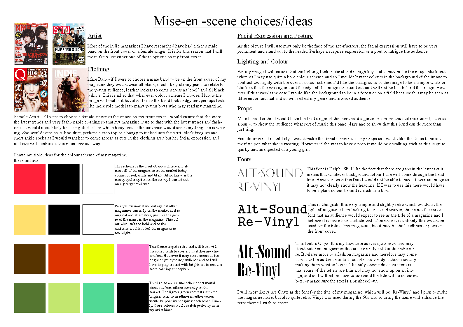
Mise-en-scene choices and ideas
Mise-en-scene choices and ideas
On this page you can see my ideas for colour scheme and the image used. I have also incorporated font ideas in this page.
 |
| Page of ideas |
Monday, 9 February 2015
Genre and Artist
Genre and Artist
On this Prezi are my ideas for genre and artist relating back to my target audience and research.Genre and Artist Prezi
How my research will inform my planning
How Research will inform Planning
Analysis
I have analysed 2 media artifacts as part of my research. Due to this I now know the average layout of the front cover, contents page and double page spread of a music magazine and so I can relate this back to my own work and the planning stages. The analysis has also helped me to see what sells music magazines and the running theme of a particular colour scheme; black, white and red; in most issues.I have seen from my analysis that the most popular indie magazines have either a popular male band or an indie female singer on the front cover. I will most likely use one of these on my front cover as most indie bands are in actual fact male and therefore my magazine will fit in with others of a similar genre.
Survey
I created a survey to establish what my target audience find most effective in music magazines. This was extremely helpful and will inform my planning as it shows me exactly what sorts of features I should include if my target audience is to actually like my product. For example I gave a range of colour options that included; red, white and black; pale yellow, white and black; green; and finally a range of light pinks and browns. The most popular option was red, shite and black and therefore I will most likely use this scheme on my front cover and throughout my music magazine.Another example of an important question from my survey is that I gave a number of possible names for my magazine and asked the audience to pick their favourite. The possible names I gave were 'Alt-Sound', 'Re-Vinyl', 'Casette' and 'Note'. The most popular 2 options were 'Alt-Sound' and 'Re-Vinyl' whereas the name 'Note' got no votes and 'Casette' only got a few. Due to this audience feedback I will use either 'Alt-Sound' or 'Re-Vinyl' as my magazine name as they both got the same amount of votes, however I prefer 'Alt-Sound' and so this will be my most likely name.
Product Placement
Researching product placement has helped me to see where most music magazines are sold and advertised. Due to this I can plan how my magazine will stand out from the rest that are currently on the market.The research of product placement has also informed me on how current music magazines advertise themselves and where most, specifically indie, magazines are sold. My magazine will be sold in a music shop and so there will be a lot of competition from other music magazines of the same genre such as NME and Q that are very popular. To ensure my magazine stands out I will have to appeal hugely to my target audience through the artist I use, my colour scheme, the overall name of the magazine and in many other ways.
Wednesday, 4 February 2015
Product Placement
Product Placement
Product Placement is an advertising technique used by companies to subtly promote their products through a non-traditional advertising technique, usually through appearance in film, television or other media. Product Placements are often initiated through an agreement between a product manufacturer and the media company in which the media company receives economic benefit. A company will often pay a fee to have their product used displayed, or significantly featured in a movie or show.Music magazines are often advertised on billboards and so they can reach a range of audiences who may not usually pick them up. TV advertisements are also very effective, especially when they are on music channels and are therefore being shown to their target audience, encouraging the audience to buy these magazines.
Music magazines are sold in a variety of places such as supermarkets, news agents, the internet, specialist shops and small magazines in modern day society can be sent via e-mail. This could be due to the fact that they can reach a range of audiences if they are sold in multiple places full of different types of people. Music magazines of specific genres targeted at specific audiences, such as Kerrang targeted at rock fans, are more likely to be sold in specialist music stores such as HMV as this is where the target audience would most likely go looking for a magazine. You can also subscribe to music magazines which means that they will be posted to your address. This could appeal to 'hardcore' music fans who will always want to receive every issue of their favourite magazine. Due to this, music fans do not have to leave their house or go to a store to find out about the latest music but it also means that magazines have to be largely advertised in order to get the message out about them.
The Product Placement of magazines in TV programmes is very limited, especially music magazines. Popular magazines in America are often used in American TV shows such as 'Time' magazine in one episode of 'How I Met Your Mother', but as music magazines are not very popular, they are not often used.
Monday, 2 February 2015
Survey Results
Survey Results
As part of my research I carried out a survey asking my target audience some questions about what music magazines they currently read and many other things. I collected the results and placed them on this Prezi. Click the link to take a look.Survey Results Prezi
Friday, 30 January 2015
Analysis of Q Magazine
Analysis of March 2015 Q Magazine
 |
| Front Cover |
 |
| Contents Page |
 |
| Double Page Spread |
Analysis of NME Magazine
Analysis of 17th January 2015 NME Magazine
 |
| Front Cover |
 |
| Contents Page |
 |
| Double Page Spread |
Thursday, 22 January 2015
Prelim task- Evaluation
Evaluation
Did you plan your magazine? If not, what have you learnt about the importance of research and planning?
I did not plan my magazine, however i did look at a few examples of other people's work to help with the layout of my pages. I learnt that research and planning is extremely important as it helps to know exactly what you are going to do and put reason behind your decisions, whereas i feel that my layout is only the way it is due to it being aesthetically pleasing.
What technology did you use to complete the task and how did you use it?
I used Serif publication and some photo editing software. I used Serif to initially design the layout and design of my cover and contents page. The photo editing software cut out my pictures and got rid of parts of images that I didn't need such as backgrounds.
Did you encounter any difficulties? If so, what were they and how did you overcome them?
I found it very difficult to choose the font and colour scheme as I was unsure about the overall appearance I wanted my magazine to take. I ended up using red, navy, black and white a these match the colours on the Edgbarrow logo and therefore link the overall appearance to the name and logo of my magazine.How successful was your magazine? Please identify what worked well, and with hindsight, what would you improve/do differently?
I think that my magazine was successful, however there are many improvements that could be made. for example, the image I used could have had better lighting, making the overall picture seem a lot more professional. I think that my colour scheme worked well as it is quite sophisticated and links to the Edgbarrow theme.What have you learnt from completing this task? Looking ahead, how will this learning be significant when completing the rest of your foundation coursework, do you think?
I have learnt that I should not always use the first idea that pops into my head but the task has also taught me how to use lots of new types of technology such as serif and photo editing software. These new skills will help me a lot with constructing my overall piece for my coursework.Monday, 19 January 2015


Subscribe to:
Comments (Atom)